an invitation to travel
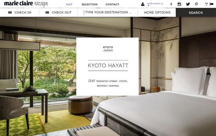
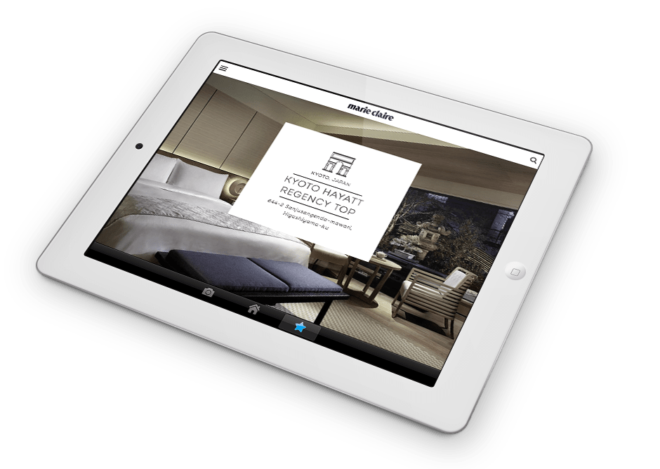
The website revolves around a 2-columns grid. In addition to give more room to the images, this allows to build rows variations and set up vertical rythm. In order to stick to the Marie-Claire identity, the font Bellota was used due to its smoothness and curves that add a sort of sensuality to the body texts. Intro was used for the hotel names as the thin drawing of its uppercase letters makes up an elegant style. “glamorous”, “luxury” and “exotic” were the keywords describing the targeted look and feel of the layout.


